Many of the comments I receive when I speak to people about my work are about colour and the colour choices I make.

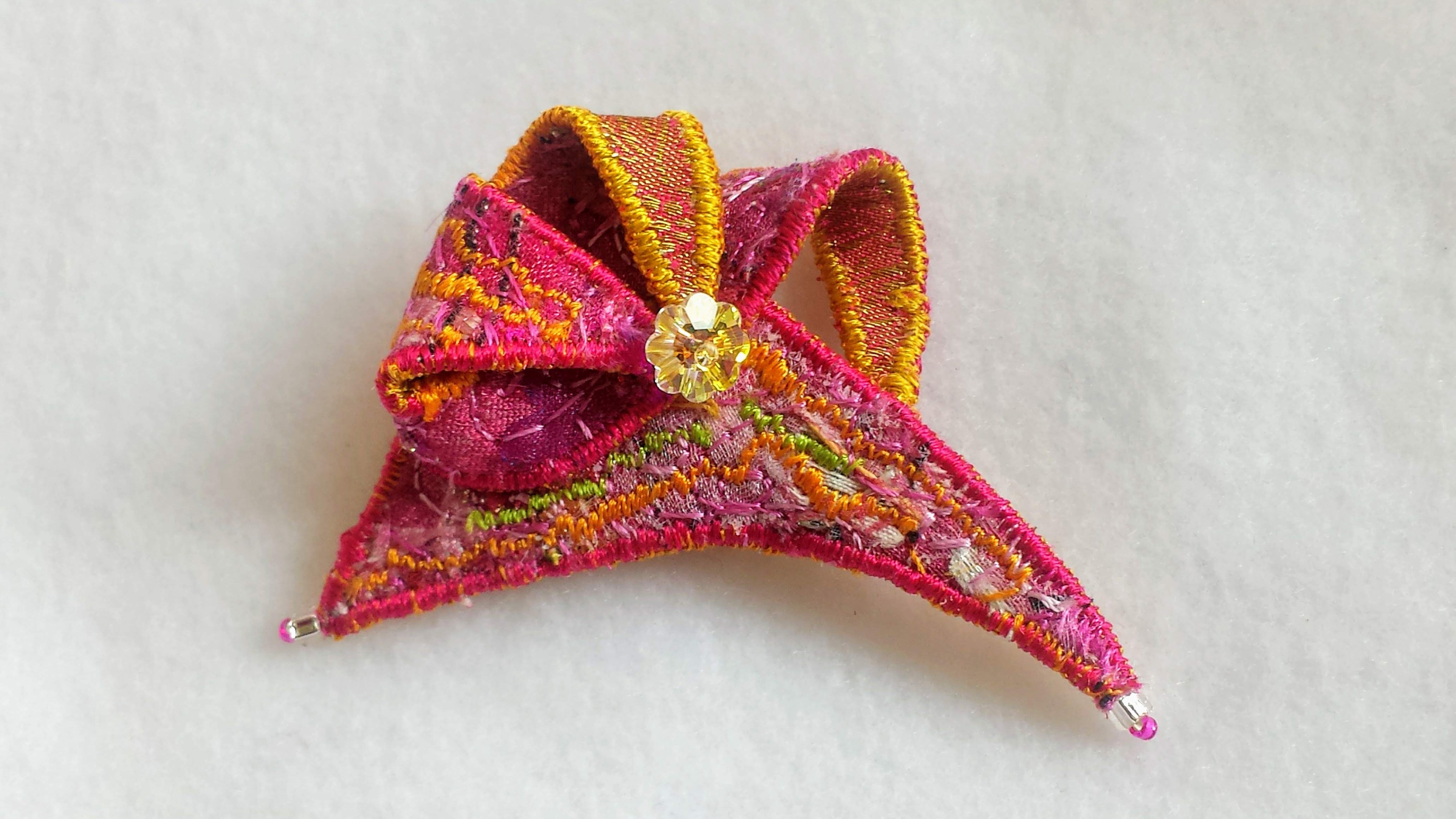
The same basic brooch using two different colour schemes
The most common question by far must be “what is your favourite colour?” and people are always seem surprised when I say that I do not have one. I believe that having favourites is dangerous for someone who works with colour as it is likely to restrict the choices you make; if you have favourites it means that you also have non-favourites.

I try to be open to every possible colour combination
Sadly for me, having no favourites does not mean that I can escape from having habits and habit can all too easily dominate an artist’s colour choices.

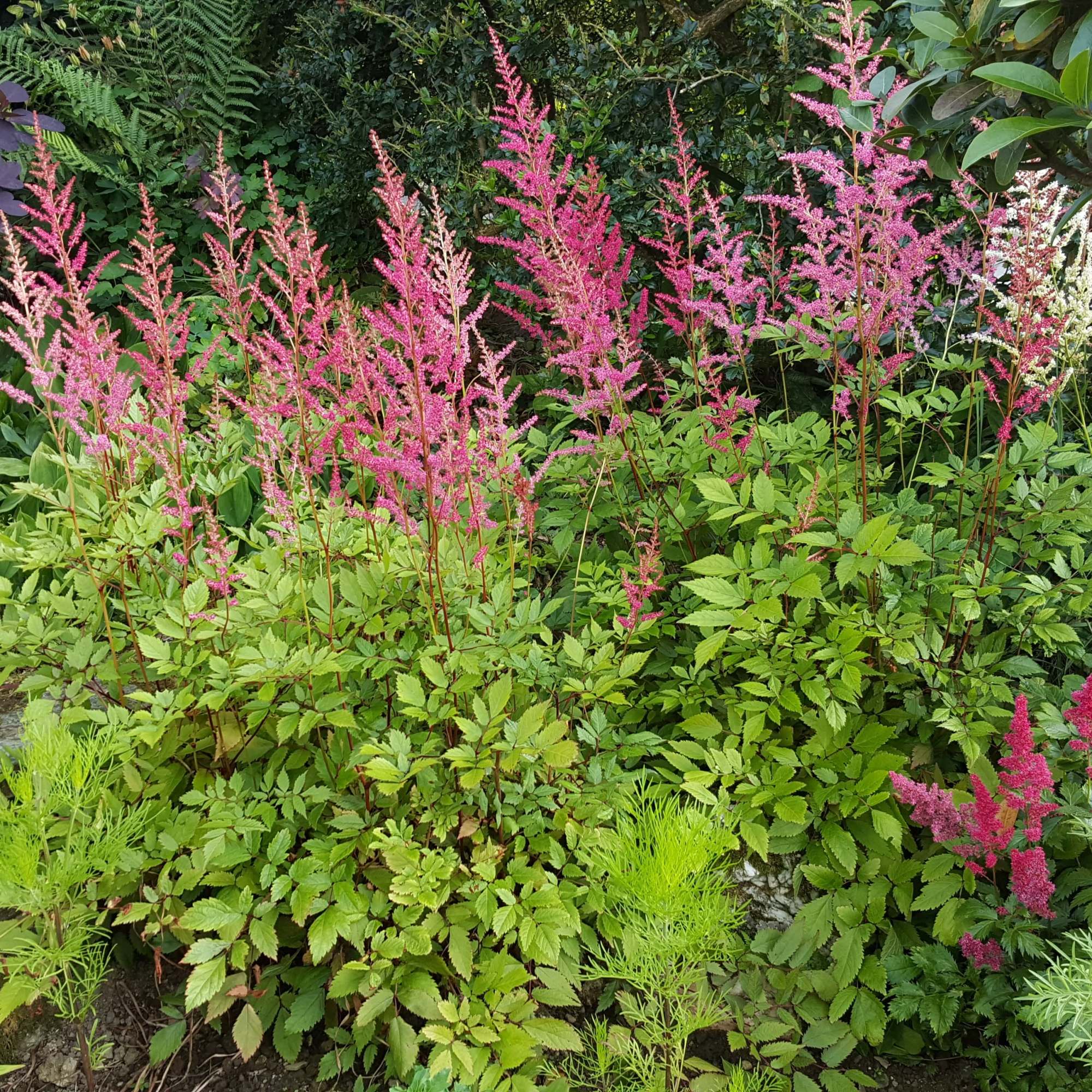
Apparently, I have a habit of resorting to rust reds and burnt oranges
The workings of colour, both from a technical and a psychological point of view is a complex subject but here are a few of my little rules of thumb.
1) How well colour-combinations work depends on context, for instance colours that look beautiful in a landscape would often look very dull if applied tone-for-tone to a small object.

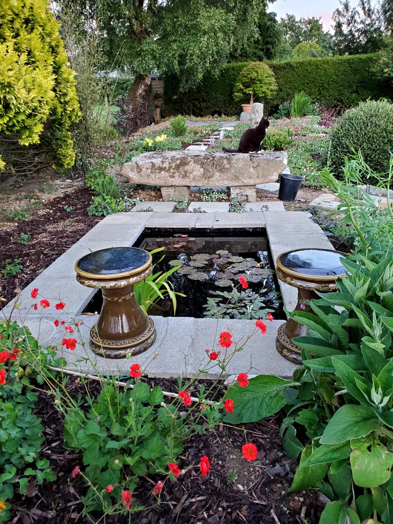
The colours of a pretty landscape are usually very subdued
The great American artist and educator Hans Hofmann taught generations of young artists that no colour exists independent of its neighbours; that the effect of a colour, both perceptually and emotionally, is determined by the colours it is placed next to.

Equinox – Hans Hofmann – UC Berkeley, Berkeley Art Museum
2) When looking at objects close-up, our eyes (and our minds) find it hard to distinguish colour as a completely separate experience from tone and texture. A flat area of colour is perceived very differently from an area where that colour has tonal variation, particularly rhythmical tonal variation.

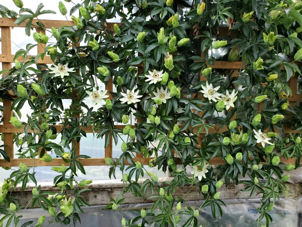
This photograph is virtually monochromatic but we see the colour as attractive because of the rhythmic tonal variations
3) For a safe rule when creating colour schemes, use contrasting colours of similar tone or use closely related colours with contrasting tone.
4) Beware safe rules – Harmonious colours are calm and satisfying but nothing excites like an unexpected combination.

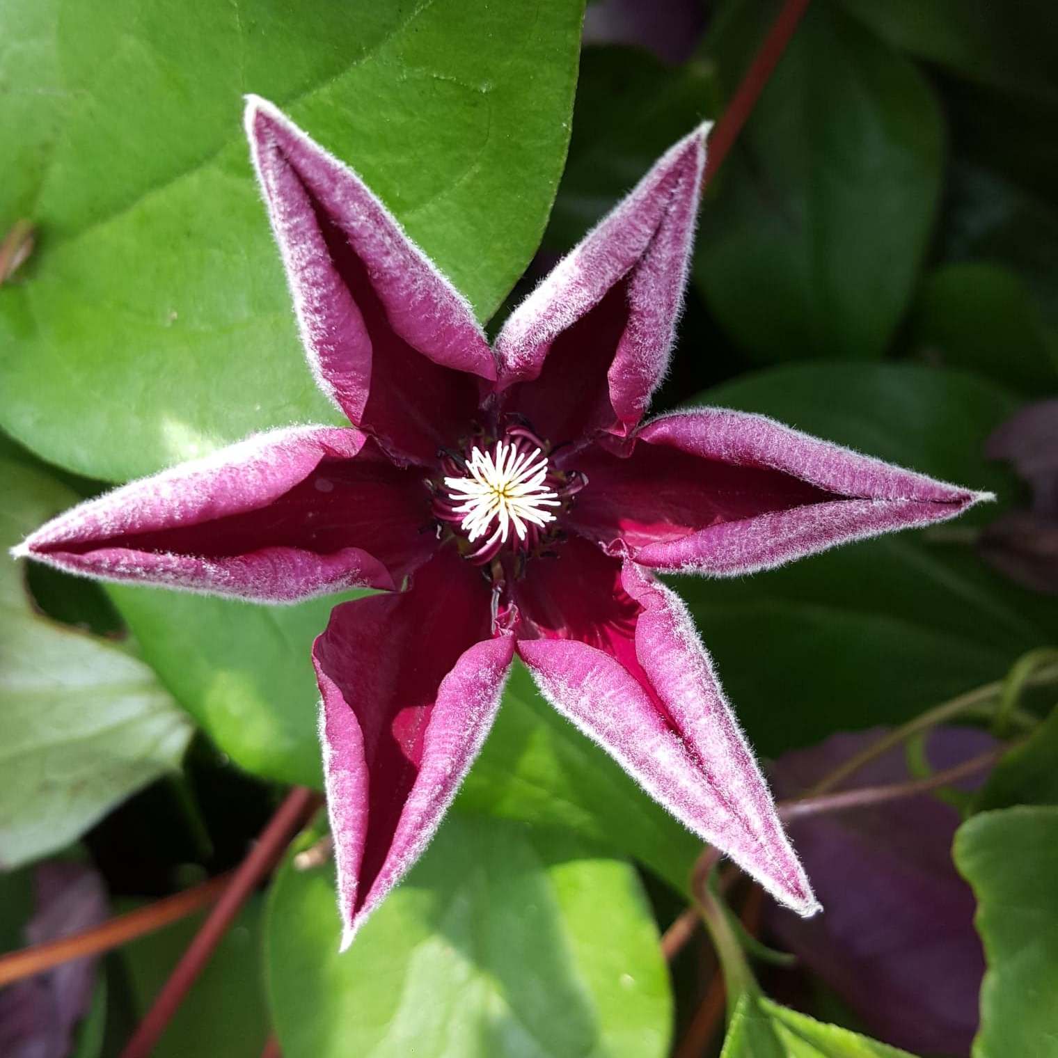
The black areas here give sparkle but they break the easy colour rules
5) Take risks – You will sometimes end up with a colour disaster but it is the secret to avoiding repeating yourself endlessly. (Amazingly however, I have found that no matter how weird the colours I use, it is likely that someone, somewhere will like them!)
6) Colourful is not the same as bright. Sometimes very subdued schemes can yield the most interesting effects.

This brooch used very subdued, even dull colours but the scheme received lots of praise
7) While there are lots of useful guidelines, the truth is that if you want to have a chance of really surprising yourself – there are no rules at all!
For anyone interested in learning more about colour in art I recommend the WebExhibits.org pages on Colour, Vision and Art